One of the core qualities of design is the ability to simplify information and deliver it in a way which is easy and effective for an audience to digest and understand. At every step of the way, we’re assessing and re-assessing who we’re talking to, what message we need to convey, and the best way to convey it. The challenge of infographic design often involves tackling a complex concept, and condensing it down into a simple symbol or diagram, an increasingly important skill in our information-rich world.
SAP provide software solutions for managing business operations and customer relations. As a global company, their organisation and their offering is extremely diverse, and communicating the multiple facets of their business to stakeholders can be a challenge. SAP have three main audiences who all engage collaboratively with the ‘Network of Truth’, allowing them to convert data into information and insights to make decisions.
Visual representation of a complex concept
Exploring examples of collaboration and networking in nature, science and the built world led us to develop an extension of a traditional venn diagram. Demonstrating a very big picture view of SAP’s ‘Network of Truth’, each overarching circle represents a different audience (business, consumer and IT) and is composed of multiple smaller circles (the various layers and stakeholders within each of those audiences). Where these circles connect is where the magic happens.
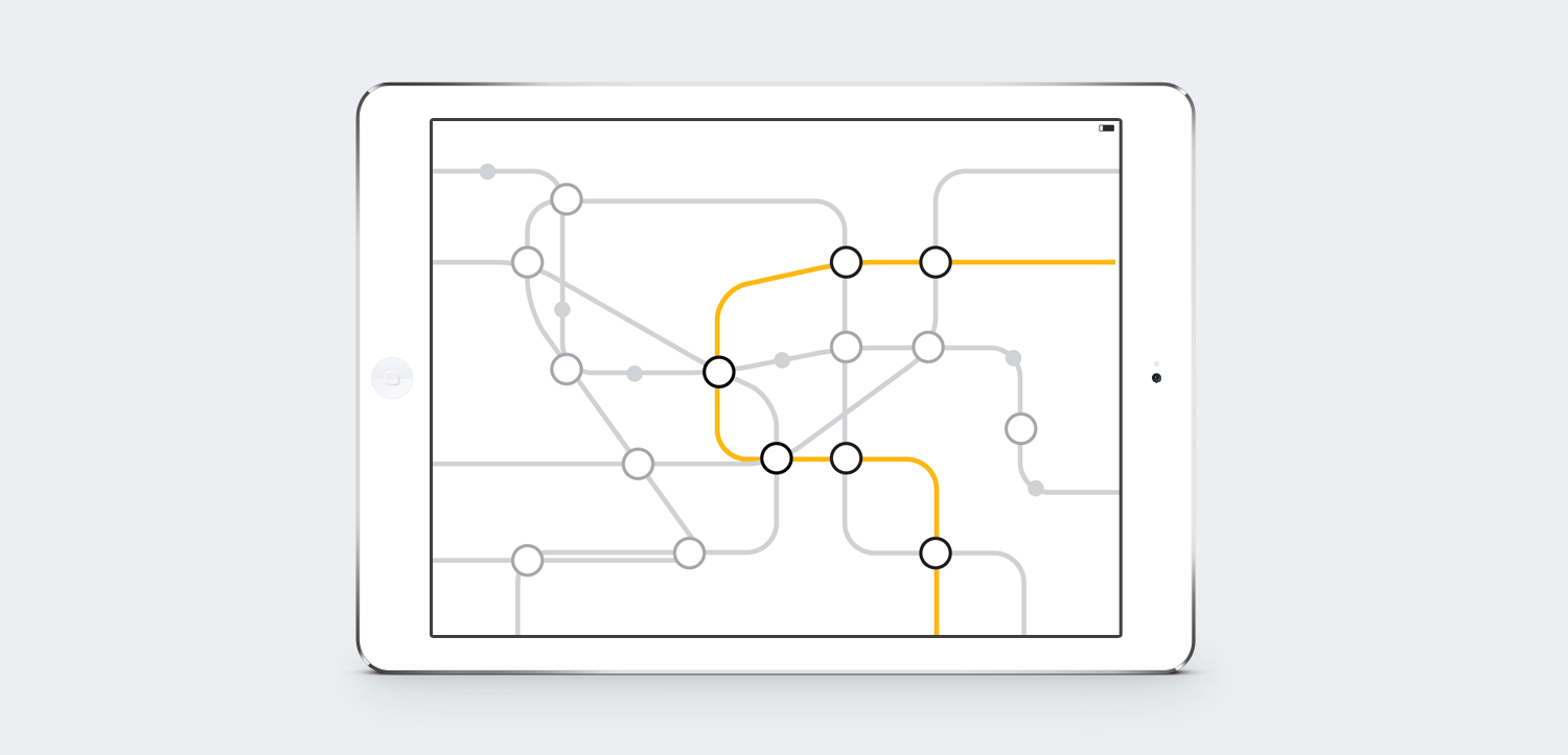
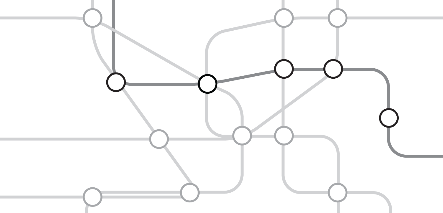
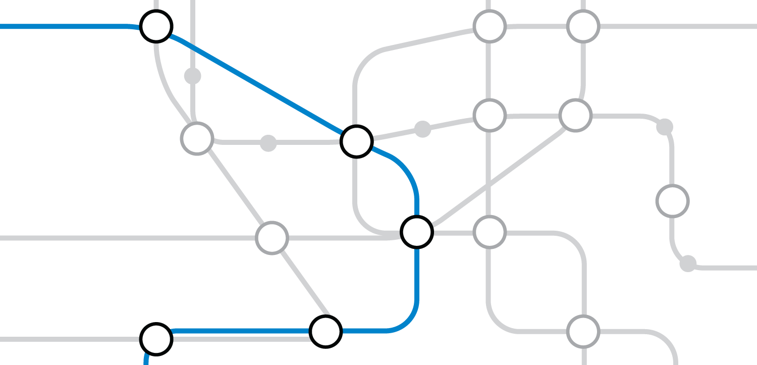
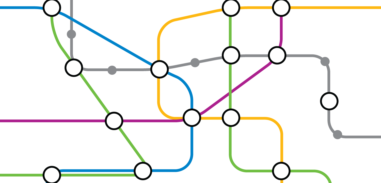
Within each of these areas is its own complex network of information and interaction. The interactions between stakeholders and data happens in a non-hierarchical, collaborative and individualised way, much like public transport network which is continually moving, overlapping and interacting. The London Underground map is recognised as one of the world’s greatest examples of information design and we took cues from this to interpret the nitty-gritty detail of the interactions happening between audience and data.
Designed for internal use, these infographics reduce an otherwise overwhelming level of interaction into an easy to understand graphic. Its simplicity allows a huge amount of flexibility for it to be expanded and adapted with major and minor landmarks and an infinite amount of potential routes.

