

In today’s consumer-driven society, we’re bombarded with hundreds of brands every day – and the supermarket shelf is one of the most challenging places to stand out. Mother’s Nature premium baby formula needed a packaging design that really differentiated it from its competitors. It needed to grab the attention of mums, quickly communicate its benefits, and feel understanding and trustworthy enough for mums to select it as their formula of choice for their precious baby.
Not all supermarket shelves are created equal
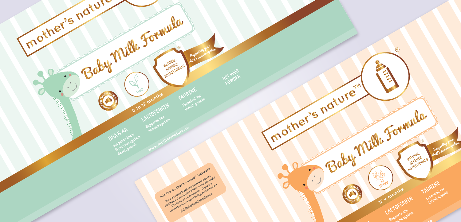
Mother’s Nature is a product intended for the Chinese market, so it was important to quickly understand the specific nuances of the industry. Baby formula is rare and expensive in China, so Mother’s Nature packaging design needed to position it as a premium product that communicated its Australian standard of quality. Creating a visual identity that looked very contemporary was important to communicate its high quality. Gold foil is common in packaging design in the China and important to include to feel familiar and relevant in the Chinese Market.
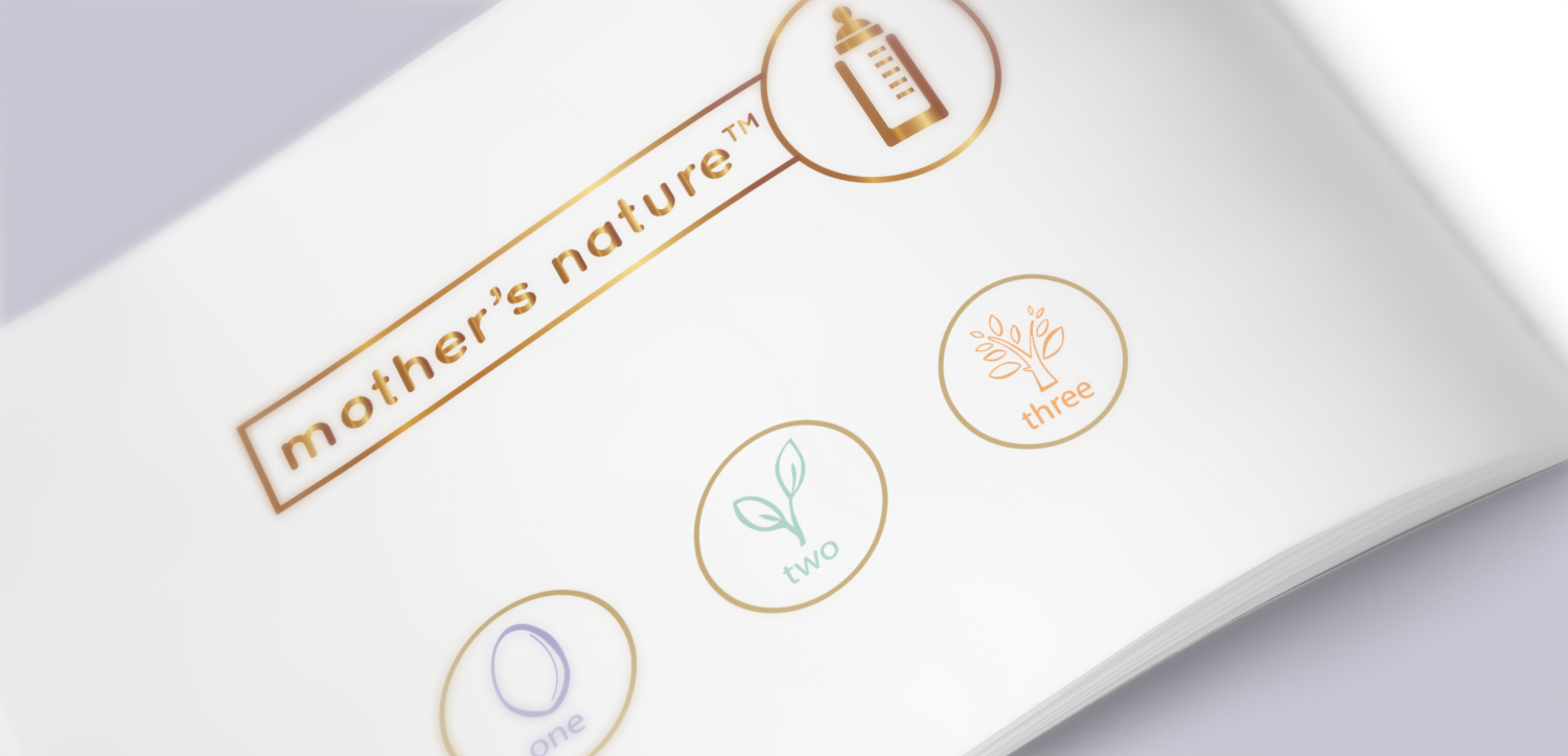
After researching and comparing competitor brands and their clinical approach to their packaging design, we developed a simple logo that was modern and friendly, using rounded shapes and letterforms and a simple baby bottle icon which was recognisable in any language. We adapted this minimal approach into symbols for the three colour-coded versions of the packaging. A little egg (0-6 months) grows into a small sprout (6-12 months) and continues to flourish into a cute little tree (12+ months). This not only explained the different products in an easily recognisable way, but carried through the suggestion that Mother’s Nature helps your baby grow.
Designing for packaging and beyond
Understanding the limitations of the packaging and printing processes were important to balancing a strong visual look with a practical package design. Reducing the number of colours in each design but making good use of the primary colour by using tints, and keeping some features and positioning of the design consistent throughout each kind helped to streamline the production process and reduce costs.
The clean and contemporary visual identity with its cute illustrations, soft pastel colours and high-quality gold foil carried through stationery design, website design and marketing collateral. Because the brand name and overarching look and feel are not formula-specific, the Mother’s Nature brand can adapt to other baby products, giving the brand flexibility and longevity.