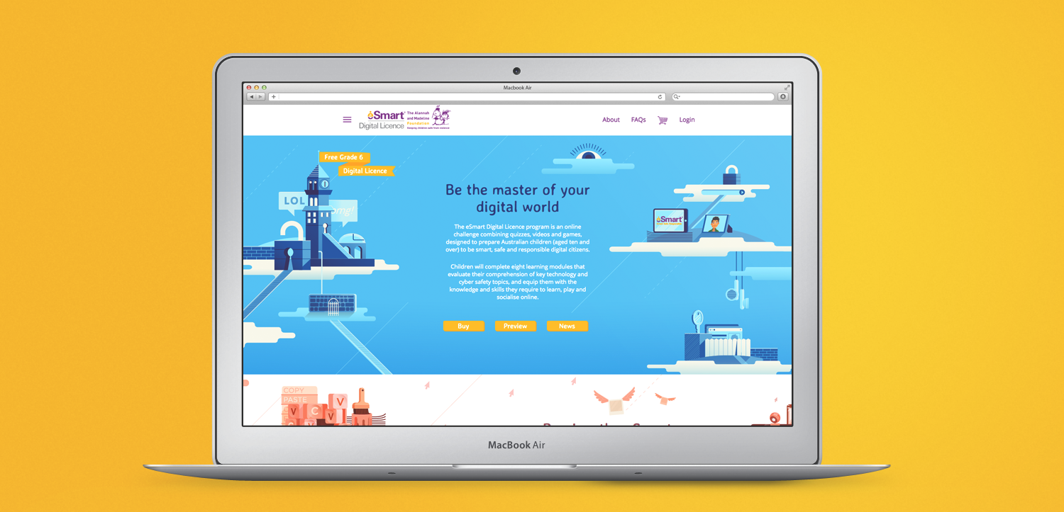
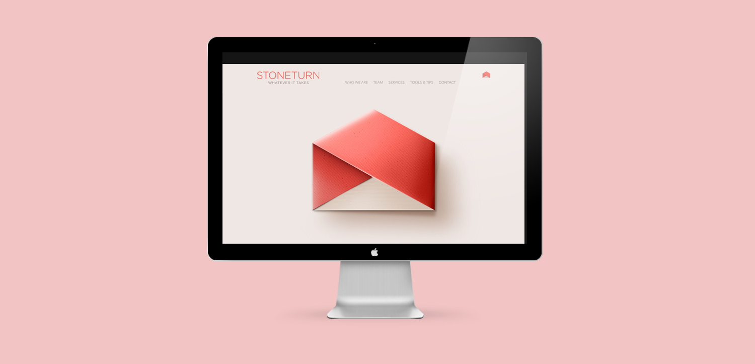
Powerpoint design is tricky territory – but that doesn’t mean it can’t look good at all. We recently worked with a lovely client wanting to clean up their formatting and styling.
Whilst no sane designer would willingly set up a file in Powerpoint, we know that you often need to – and it helps to have a strong base to leap from.
Here are a few tips to assist you.
Consistent Template Use
Make sure you stick to the template. It gives the viewer a sense of flow from section to section and they know where you’re headed with all that content.
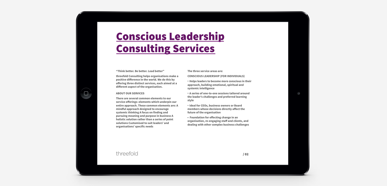
Big, bold fonts for header pages and section breaks.
Don’t be afraid to use really large type (with few words). It makes a heading feel like a heading.
Speaking of fonts… There are some people who still use Comic Sans. Perhaps we need to take them out for coffee with Peanuts. Calibri. Calibri. Calibri.
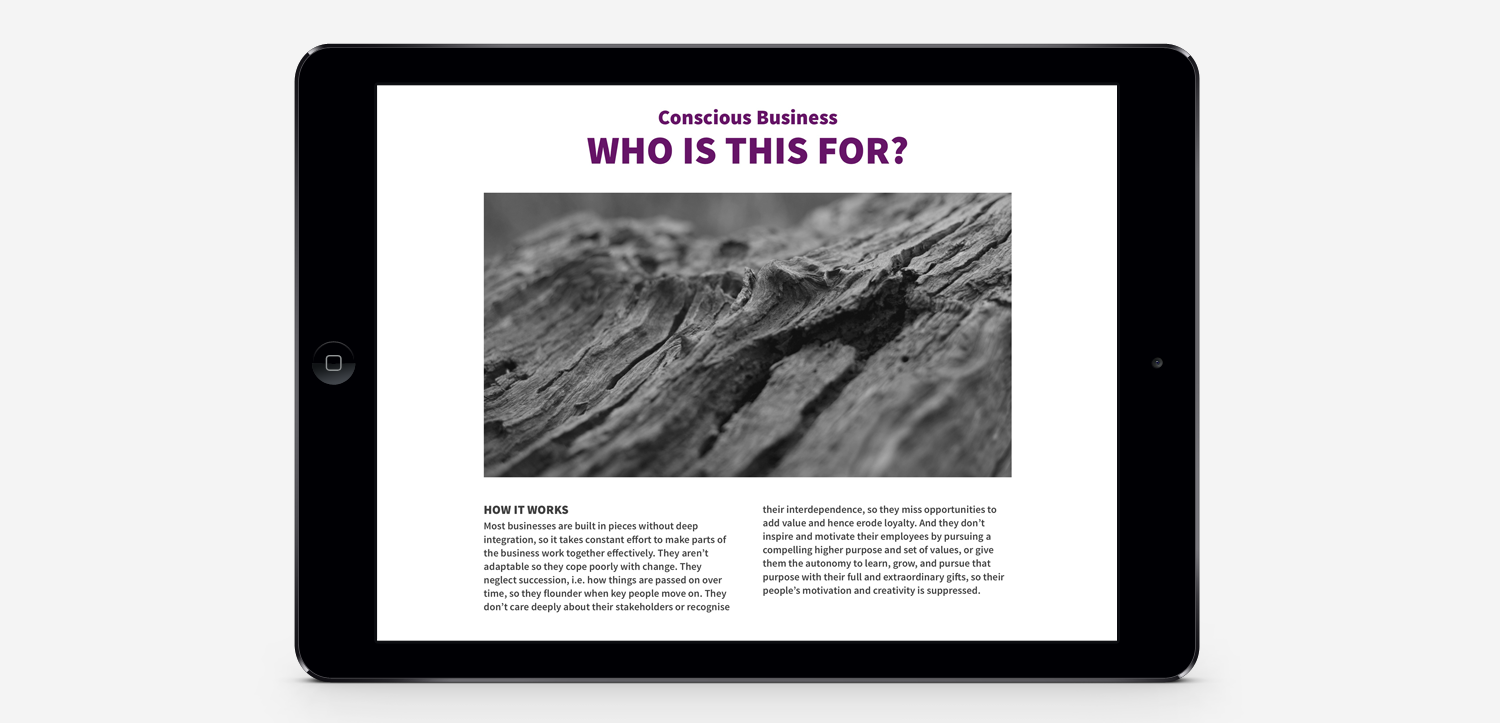
Use images with thought
Which of these would look better? A picture of a sunrise?
A picture of a sunrise with a carrot on the ocean?
A picture of a sunrise with a carrot and a child playing the corner?
A picture of a sunrise with a lighthouse that was in the original picture?
The less, the better.
The larger the image, the better (unless it’s pixelated).
If something wasn’t in the picture in the first place, avoid photoshopping it in. One large image gives more effect than 5 mixed size ones.
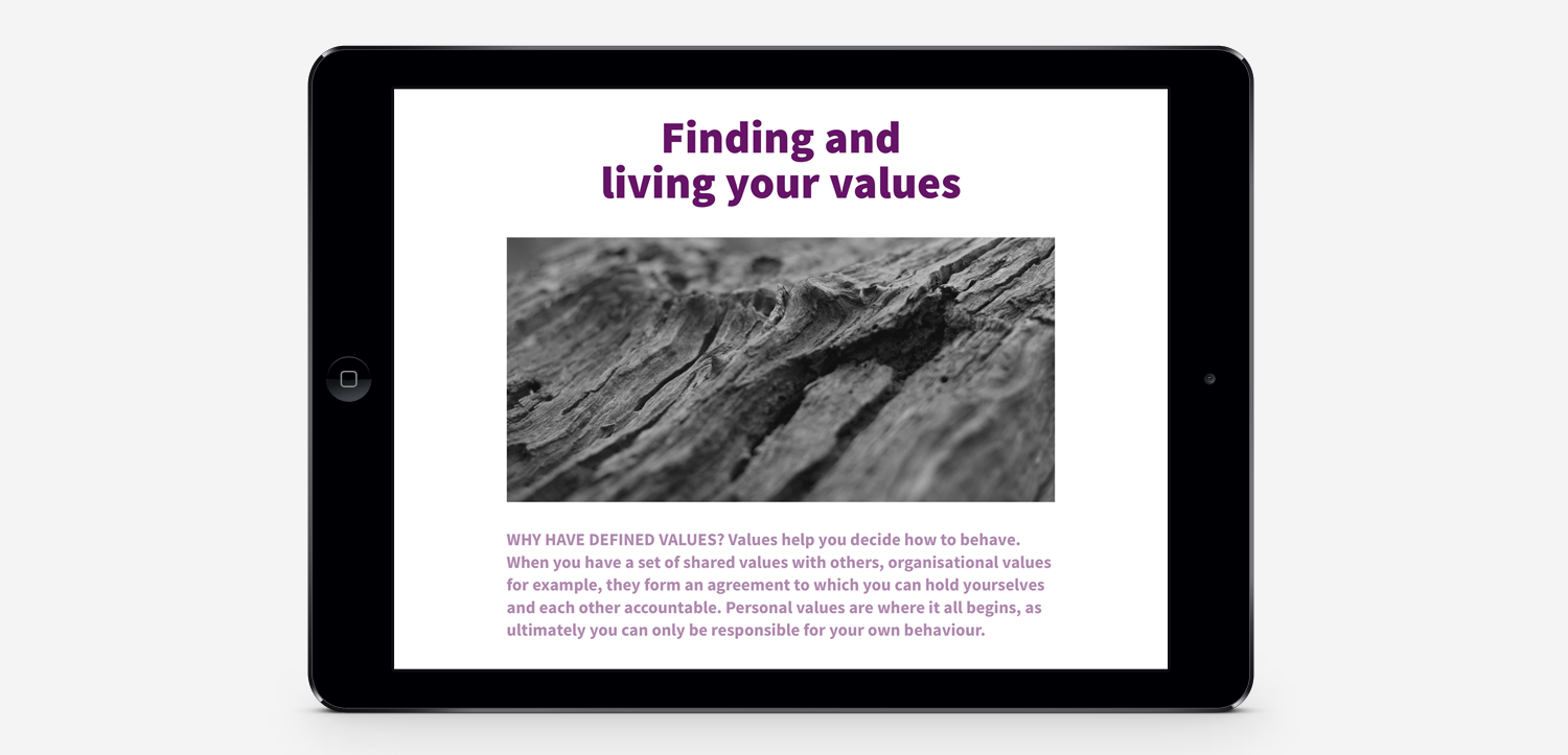
Avoid centred type and too much type
Powerpoints aren’t meant to be content heavy. Supporting documentation is what your client can print and read at a cafe. The powerpoint? No ideal.
When possible, keep the supporting content in a word document and make the powerpoint your key point seller. If you do need to use lots of text, we recommend placing it in columns – much like a newspaper. You’ll fit more in and it’ll be easy to read.
Centred type has it’s place in poetry, engaging design (when used consciously) and maybe Enid Blyton books. But outside of that, you need a clean, crisp professional layout. Left and right aligned are ideal. When in doubt, roll with the left.
Be bold in your area of expertise
I can’t fake a conversation about BAS and GST. It just isn’t my forte. Neither is dentistry.But if we’re talking design, it’s where I’m at play. It’s my zone.
If design isn’t your zone, stick to what you know will work. Try a little play, but do your research and know what you’re saying before you dive.
Check the file size
If this is a beauty you want to email around, check the file size. Most large organisations have a 10MB limit. If you can’t crunch down your images any smaller, try sending them via WeTransfer instead of email.
Got any questions on more Powerpoint design? We’ve offered clients a review session where we give them feedback and recommendations. If it’s a small question – Kish is happy to help if you flick her an email :)
Helpful? Share it!


